made with Svelte
Description
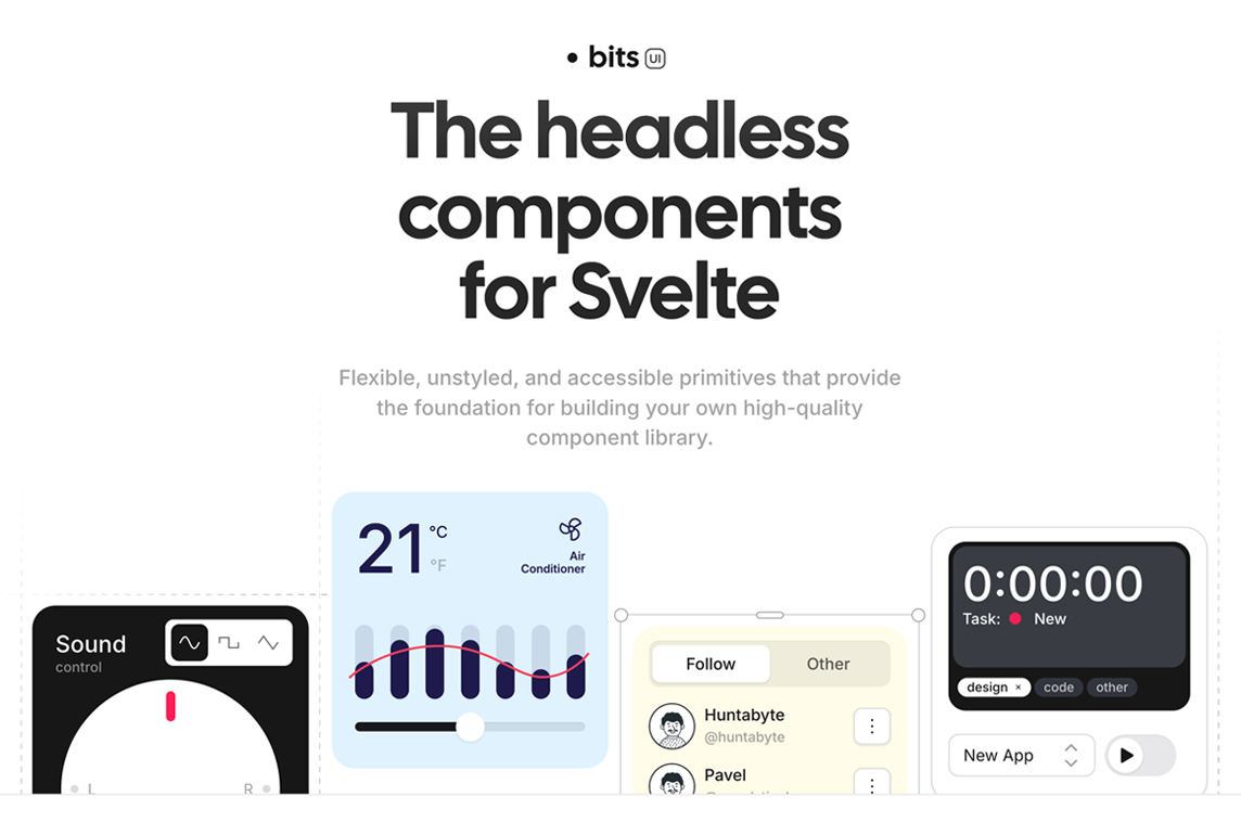
Headless Component Library
"Bits UI is a collection of headless component primitives that enable you to build your own custom components. They have been thoughtfully designed to prioritize simplicity without compromising customizability.
Under the hood, most of these components are powered by Melt UI, which provides an even lower-level builder API for creating headless components. We take that API and wrap it in a more familiar component interface, which allows us to handle some quality of life improvements for you."
Creator
Hunter Johnston
@huntabyte

Social Media Links