Welcome to the Bob Ross virtual art gallery! It's been a hard year, and we could all use some relaxation.
And what better way to relax than with Bob Ross? Jared Wilber has collected data on the 403 paintings that Bob Ross painted during his Joy of Painting series, and I've presented them for you here in a virtual art gallery.
For each painting, we also have some information on how it was painted, such as which colors the painting used. Let's take a brief tour of Bob Ross' colors before getting to the gallery.(or, skip directly to the gallery)
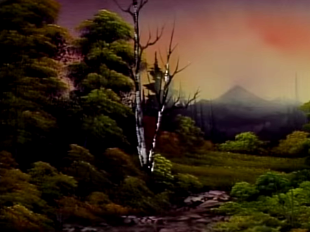
This is every piece Bob Ross painted in The Joy of Painting. Each rectangle represents a painting.
There are 403 rectangles, organized chronologically. Go ahead and hover over a rectangle to see the painting it represents!
To get a feeling for Bob Ross' process, we can organize the pieces by the number of colors used to paint them. The height of a bar represents how many paintings used that number of colors.
Most commonly, paintings have 12 colors. Of the 403 pieces in The Joy of Painting, 100 used 12 colors.
The peak is concentrated around 12, meaning most of Ross' paintings used somewhere in the range of 7-13 colors; very rarely did they venture outside of that range.
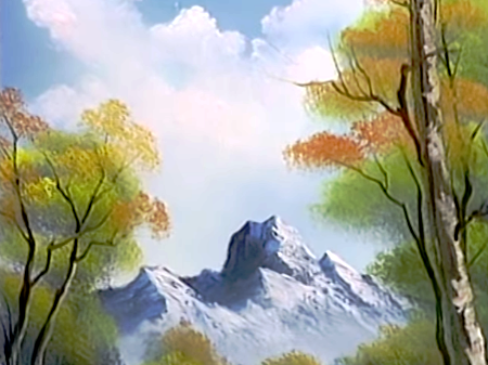
A great example of this prototypical painting is Wilderness Day. This was The Joy of Painting's series finale, and Bob Ross' final painting before he passed away on July 4, 1995.
On the contrary, one painting used only one color. That painting was Contemplative Lady, which was painted by a guest on episode 6 of season 16.
The guest painted Contemplative Lady with one color: Van Dyke Brown.
So, which colors did Bob Ross use most often? This chart shows how often each of Bob Ross' colors were used throughout The Joy of Painting.
Unsurprisingly, the most common color in Bob Ross' palette is a solid white.
Ross uses a solid, pure white in every painting, sometimes as a base for the overall piece (in what he calls Liquid White) and sometimes throughout (in the form of Titanium White).
Another way to visualize Ross' use of colors is to look at each painting, one by one.
Here, each line represents one use of that color in a painting (with the paintings arranged chronologically on the X axis).
Here, we notice patterns. At the end of Season 6, Bob Ross moved away from Burnt Umber and moved toward Dark Sienna.
The two colors are similar enough that Ross could easily substitute one for the other without much aesthetic difference in his art.
We can also see which colors Bob Ross used least, and where they appeared.
Here, for example, we see Ross' single use of the color Indian Red. That color occurred in one painting: Autumn Images (season 22, episode 1).
Bob Ross painted 403 paintings throughout his PBS series The Joy of Painting. (Technically, he painted 381 and guests painted the others.) Ross is remembered for his paintings, but also for his soothing voice and calm demeanor. He was an "internet celebrity before the internet existed."
I hope this tour of Bob Ross' work has helped you appreciate his legacy. Below, you can explore all of Ross' artwork from The Joy of Painting in a virtual art gallery. For each piece, you can see the colors used, and watch the YouTube video of its creation. Not interested? Click for another painting!
From all of us here at the Bob Ross Virtual Art Gallery, we'd like to wish you happy painting, and God bless, my friend.

